I get sick to my stomach every time I watch the daily 5 pm presentations from Washington, because as learned as these people may be, nothing they predict is showing up later in reality.
Let that sink in. If an analyst’s assessments never pan out, either they’re BS’ing you and they know it, or they don’t know what they’re talking about. Either way, if lives hang in the balance you should run away, fast: you should proactively ignore their advice and think for yourself.
I mean, they sound knowledgeable, but all their assurances about things being under control are crap. Look at the numbers – which they should be doing.
A lot of people in the US are likely to die soon. They’re acting like that’s not true – except when they suggest that people like me would be happy to die, to save the economy.
Below, I’ll paste in my Thursday Facebook post. When Friday’s numbers come out, I’ll add those.
Today I want to focus on a different statistic – how rapidly the count of confirmed cases is doubling. I emphasize “confirmed” because we still don’t have nearly enough testing kits, which is exactly comparable to fighting a wildfire and not having reports from most counties so you don’t really know how big the fire is. That’s us.
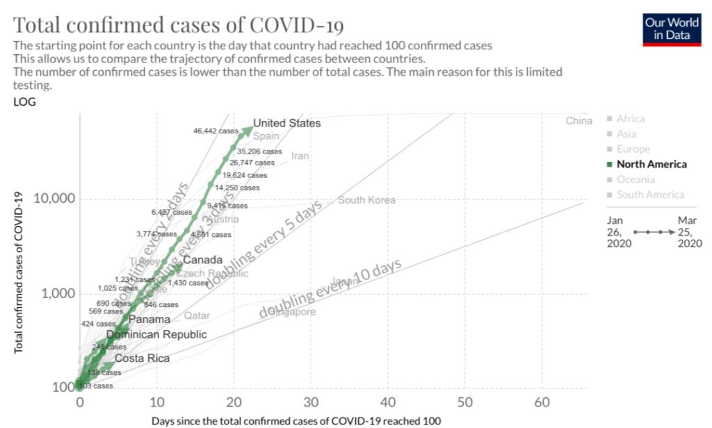
This first chart from Our World in Data today (at top of this post) is messy to read but you can see the US case count (the green line) has been steadily rising, doubling every 2.5 days. (It’s halfway between the faint diagonal lines labeled “Doubling every 2 days” and “Doubling every 3 days.”)
That means in 7 days the case count doubles 3 times, which means it grows 8-fold. (Double, then 4x, then 8x.)
Does the recent history bear that out? Let’s test that by checking the numbers. Yesterday (3/25) you can see that the count was 46,442 cases; seven days earlier it was 4,661. That’s TENfold, not 8. So yup, that really is happening.
The trend line is steady so far, and the way these complex behaviors work, they continue unless something changes. If it continues for another week, that means by April 2 we’ll have 8-10x more cases than today: 400-500,000 confirmed cases in the US, plus some number of unknown (not tested) sick people.
It makes me sick to watch the COVID-19 task force on their daily briefings acting like this isn’t happening. “A hospital ship with 400 beds will arrive in LA Monday,” they say. FABULOUS news when we have 400,000 more sick people arriving, across the country. Time will tell which of us was on target. I’ll see ya in a week.
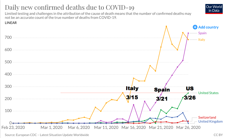
Today’s second chart shows that the US continues to track 11 days behind Italy and 5 days behind Spain. Both of those countries are now at 700 deaths a day (top right part of chart), so *IF* the pattern holds, we’ll have 700 deaths a day in 5-10 days. I’ll see ya in a week to see how it panned out.

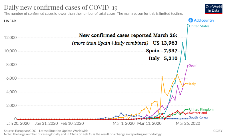
The third chart shows, very unfortunately, that unlike Italy, we have not turned the corner on new confirmed cases. Yesterday the US had 14,000 new confirmed cases, more than Spain and Italy combined.

As of 5:30 pm Thursday, the US has more cases than anyone in the world – 81,000. And it’s rising. (By 6 pm the TV said it was 82,000.)
Our only hope to avoid disaster and thousands of US deaths is to STOP THE SPREAD by STAYING HOME as much as possible. Anyone who doesn’t see what’s coming – even if they’re on the task force – doesn’t know what they’re talking about. Think for yourself.
Remember – a week from now there may be ten times as many US cases as today, 100x more than a week ago. So the behaviors that kept you safe may no longer be sufficient. DON’T STOP BEING CAREFUL. The danger is still invisible but increasingly present.


We are doing a ton of testing multiple weeks into the outbreak and did essentially none in the first few weeks (going back to Jan). So, our numbers are sky rocketing on a slope since we had such small numbers early on.
We have real issues, but will not be as dire as these graphs show / suggest.
Note – also, US death rate is much lower at this point, further confirming our growing denominator of cases now includes many less severe as well.
We have also have multiple outbreaks vs 1 focused “hotspot” so, looking at NY and Wash as distinct, for instance, will help.
We shall see, John. I word it that way intentionally.
And we have no idea at ALL what the death rate is, because we have no idea how many cases there are. We shall see.
All our discussions today about what’s going on under the surface are nothing compared to what actually unfolds. :-)
I would, though, assert that you have no basis to say “will not be as dire.” Besides, goofball, these graphs don’t show the future – they’re a plot of what already happened!
Go back three days to what I said about TESTING WHETHER the US is actually tracking 12 days behind Italy. Everything I say about this stuff is “IF.” I very much hope you know the difference between a graph of historical data and a prediction. If you aren’t clear about that, please think about it and ask for help if you want.
Your information concerning the two hospital ships, mercy and comfort was misleading. U claimed they contained 400 beds, when In actuality they contain 1000 in each ship. U r obviously confused about the graphs and actual numbers of the infected and the deaths.. the team the President has assembled is doing a fabulous job getting a handle on vivid-19. One thing I agree with u is, stay home, keep your social distancing, wash your hands and Clen and disinfect regularly, until the pandemic levels out and areas like NY, WA, NJ, CA, & LA get under control. The country was invaded by the Chinese outbreak, of which their leadership withheld vital information about this virus from the Global community..Thank God out President had the instinct and wisdom to shut flights down with in days of discovering this attack. We’re not done with Communist China yet!
Hi Peter! Thanks for the correction on the number of beds per ship. I’ve edited the post.
What do you mean about me being confused about the graphs?